How to customise candlestick colors
Candle Colour & Chart Appearance
Every trader reads charts differently.
Some rely heavily on candle momentum. Some look for rejection. Some prefer to focus on trend continuation over short-term pullbacks.
Yet most trading platforms present charts in the same default color scheme, green for bullish and red for bearish, with the same background, grid intensity, and visual contrast.
Over time, this forces you to adapt to the chart.
Instead of letting the chart adapt to how you trade.
How to Personalise Chart Colors
Chart Appearance Customisation on Sahi allows you to personalise how price movement is displayed, helping align the chart with your own visual interpretation of the market.
On Mobile
Open any chart and just click on the three-line menu at the top right corner ---> 'Setting' --> and go to 'Colors.'
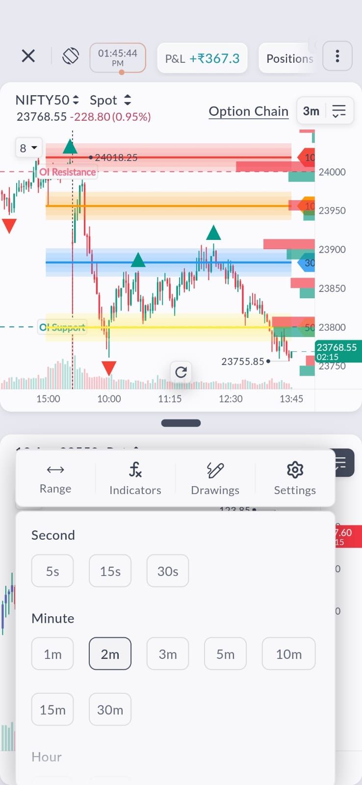
From here, you can customise candle body colors for positive and negative moves, along with background, grid lines, crosshair, session breaks, and text.
On Web
Open a chart and access the Chart Settings panel.
Navigate to the Colors tab and modify the required chart elements.
Your personalised settings will reflect immediately once you click on 'save'.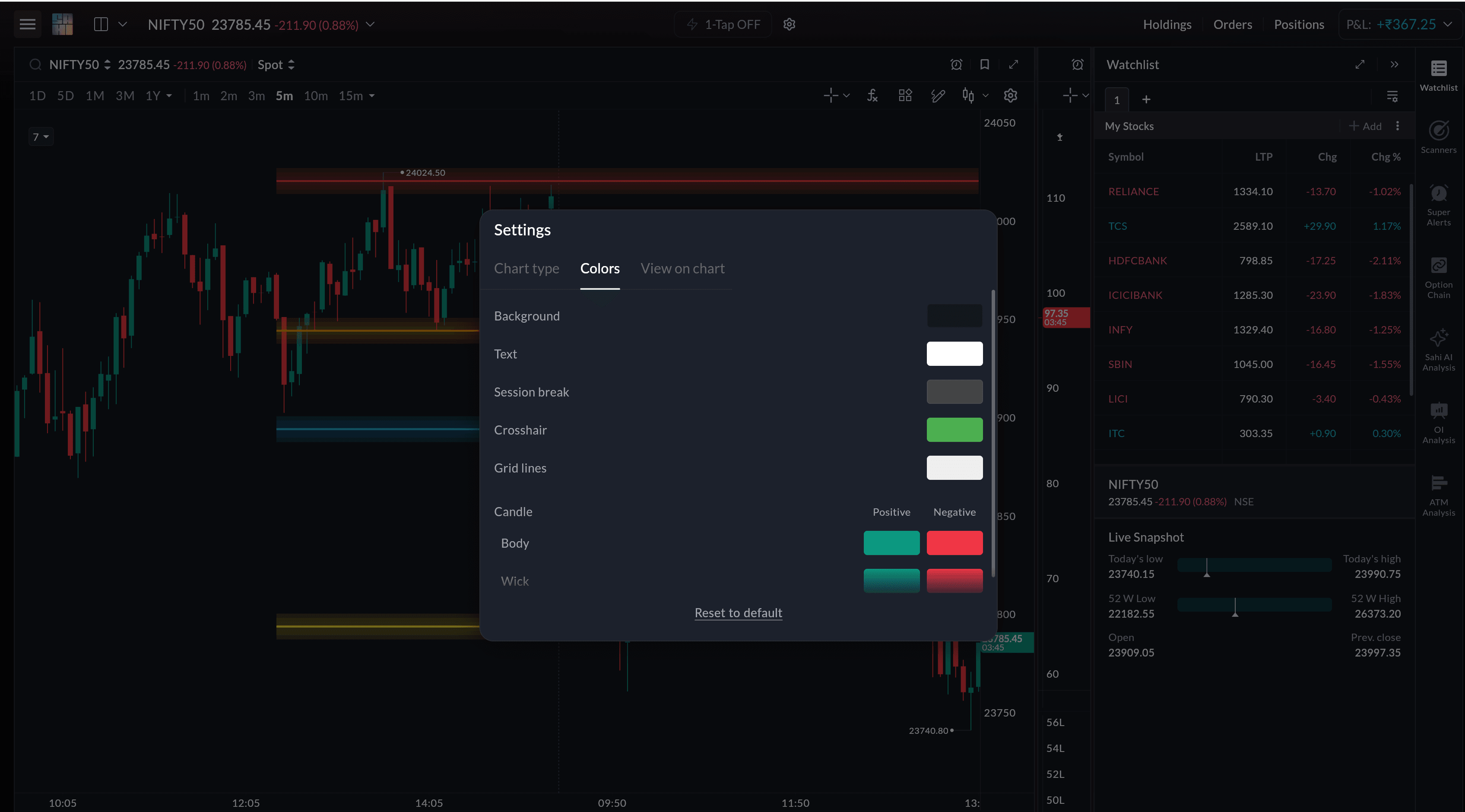
Some may want stronger contrast between bullish and bearish candles to clearly identify trend continuation. Others may prefer a softer color distinction to reduce visual noise during consolidation.
You can customise how positive and negative candle bodies appear on your chart, as well as their wicks, allowing price movement to stand out in a way that matches how you process setups.
This becomes particularly useful when monitoring short timeframes where momentum shifts can occur rapidly.
Apart from candle colors, you can also personalise: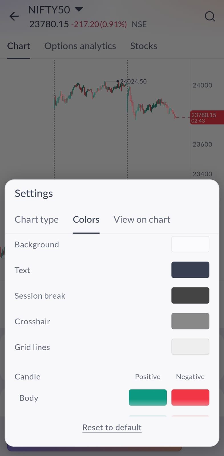
-
chart background
-
grid lines
-
crosshair
-
session break markers
-
text colour
Adjusting these elements can improve readability, especially when analysing multiple charts during live sessions.
Some traders prefer a darker background with reduced grid contrast for trend clarity, while others may want stronger grid visibility when working with support and resistance levels.
Improve Recognition During Live Markets
When charts are visually aligned with your trading style, it becomes easier to:
-
recognise breakout continuation
-
identify potential reversals
-
distinguish trend from pullback
-
track momentum shifts
Instead of relying only on indicators, personalised chart visuals allow price action itself to become more readable.
Also, if you want to revert back to the original settings, it's just a single tap on the 'Reset to default' button. This way you go back to the original settings.